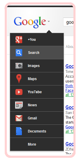
So this the new year and everything is getting newer and so the Google is also experimenting on it's look,this look is not currently visible to all users , you can see this only when you are logged out because it's in test and when it's fully out you will be able to use it or may be a disable option too.
This time Google has removed the top bar and brought it into a hover menu, you will notice a small arrow pointing down near the GOOGLE logo in Google's homepage , you just need to hover it and list of menus will appear , if Google make this change and release it to all users it may be possible that some users will face difficulties to navigate through pages , because users were using the bar to navigate to VIDEOS,IMAGES,YOUTUBE etc and there was a sign in button too on the top bar. Yet there's the menu on left side and users can easily navigate through it too.
Have a look what Google is cooking for you !

Do you like this change ? Please comment and rate !
Related Searches:-
● Google's new look
● About Google's new look
● What's new in Google in 2012
● Is Google going to make any change this year
● 2012 Google changes
● Google menu bar disappeared ?
● Changes to Google Looks and Menu bar
● Google's new change is good or bad
● No menu bar in Google
● Google home page changes
Comment Below
