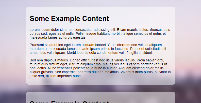
In this short tutorial you will learn how to add an image as the background of your blog that stretches to all edges thus fills your entire blog's background portion.
Looking to add a nice effect to your blog by using beautiful pictures as background images? It is a great way to personalize a blog, depending on the color scheme of your blog and the feel that you want the blog to have can all be improved by using an image as the full background.

This tutorial will be guiding you through the process of setting a custom full size image on your Blogger blog with a few lines of CSS as well as showing a way to give it a blurred glass effect.
Here's a quick demo of what you are going to have on your blog by following the steps to add the CSS to your blog: Full Page Background Image Blurred Effect using CSS
Copy the CSS code and paste it in another Notepad / Textedit window.
In this code, replace IMAGE-URL-HERE with the image URL we got in the last step.
I've done it, what now? Now that you have placed your image's URL in the code we are ready to make it appear on the blog. but before that please do take a backup of your existing blog theme.
We assume you are still in the Advanced > Add CSS page in the Theme designer from the last step. A small change in the URL of the image is required to get the blurred effect - that is to reduce the size of the image. Yes, the smaller the image the more blurry it will be. So that's our general idea, instead of using a photo editor app to make the original image blurry we use a small version of the original image.
Let's suppose your code is this, the URL of your image is of course different than the one in the following one.
In the URL of your image, which may look something similar to this:
Change the number with the s prefixed to it to something smaller.
s32 means the CSS code will load a version of the image that is only 32 pixels wide, so when a small image stretches from edge to edge on a screen it becomes blurry and gives the perfect effect we want.
You can change the value to whatever you like to adjust the level of blurriness of your background image. Change that small part in the code and again click on Apply to Blog to update the CSS code and make it go live on your blog.
Looking to add a nice effect to your blog by using beautiful pictures as background images? It is a great way to personalize a blog, depending on the color scheme of your blog and the feel that you want the blog to have can all be improved by using an image as the full background.

This tutorial will be guiding you through the process of setting a custom full size image on your Blogger blog with a few lines of CSS as well as showing a way to give it a blurred glass effect.
Here's a quick demo of what you are going to have on your blog by following the steps to add the CSS to your blog: Full Page Background Image Blurred Effect using CSS
Uploading the image
Whatever image you are going to use you have to upload it somewhere in its full size first. The best place to upload it is Blogger itself, it gives unlimited photo storage as well as fast servers from Google wouldn't ever slow your blog down.
- Open a draft post in your Blogger dashboard
- Upload the image
- When the image appears in the post area, right click on it and "Copy image address" or "Copy link address", the option might be different on different browsers.
- Paste the copied URL that is the image's address in a Notepad / Textedit app. We may get something like this
https://blogger.googleusercontent.com/img/b/R29vZ2xl/AVvXsEh_7oZ_LJa_g5SODLhOGfZtXOEO5pHRlEUPE0AS0u7HKook13gattMlwq4Z4rP30qUWvZc6egxKy_jDwKR0nT42djGNVVe2e33YF3lax8MYGGvfrHM4q4AWmxUaBI8npq6A2ixu4AA4X_Nj/s1600/photo-1434394673726-e8232a5903b4.jpg - Keep it with yourself, we will need this in the next step.
The CSS Snippet
CSS is what makes it possible for us to add designs to our websites and blog. This one does the job for adding a full screen background.
html, body {
    background: url('IMAGE-URL-HERE') no-repeat center center fixed;
    -webkit-background-size: cover;
    -moz-background-size: cover;
    -o-background-size: cover;
    background-size: cover;
}
Copy the CSS code and paste it in another Notepad / Textedit window.
In this code, replace IMAGE-URL-HERE with the image URL we got in the last step.
html, body {
    background: url('https://blogger.googleusercontent.com/img/b/R29vZ2xl/AVvXsEh_7oZ_LJa_g5SODLhOGfZtXOEO5pHRlEUPE0AS0u7HKook13gattMlwq4Z4rP30qUWvZc6egxKy_jDwKR0nT42djGNVVe2e33YF3lax8MYGGvfrHM4q4AWmxUaBI8npq6A2ixu4AA4X_Nj/s1600/photo-1434394673726-e8232a5903b4.jpg') no-repeat center center fixed;
    -webkit-background-size: cover;
    -moz-background-size: cover;
    -o-background-size: cover;
    background-size: cover;
}
I've done it, what now? Now that you have placed your image's URL in the code we are ready to make it appear on the blog. but before that please do take a backup of your existing blog theme.
- Log-into your Blogger Dashboard
- Go to the Theme
 section
 - Click on "Customize"
- In the Theme Designer go to Advanced > Add CSS
- Paste the CSS snippet into the text area on the theme designer page and click on Apply to Blog on the top right
Open your blog to see the updated background image. Right now you wouldn't see the blur effect, we will see how to do that in the next step.
Let's give it a blurred effect
We assume you are still in the Advanced > Add CSS page in the Theme designer from the last step. A small change in the URL of the image is required to get the blurred effect - that is to reduce the size of the image. Yes, the smaller the image the more blurry it will be. So that's our general idea, instead of using a photo editor app to make the original image blurry we use a small version of the original image.
Let's suppose your code is this, the URL of your image is of course different than the one in the following one.
html, body {
    background: url('https://blogger.googleusercontent.com/img/b/R29vZ2xl/AVvXsEh_7oZ_LJa_g5SODLhOGfZtXOEO5pHRlEUPE0AS0u7HKook13gattMlwq4Z4rP30qUWvZc6egxKy_jDwKR0nT42djGNVVe2e33YF3lax8MYGGvfrHM4q4AWmxUaBI8npq6A2ixu4AA4X_Nj/s1600/photo-1434394673726-e8232a5903b4.jpg') no-repeat center center fixed;
    -webkit-background-size: cover;
    -moz-background-size: cover;
    -o-background-size: cover;
    background-size: cover;
}
In the URL of your image, which may look something similar to this:
https://3.bp.blogspot.com/..............ynOTNfQCKgB/s1600/photo-1434394673726-e8232a5903b4.jpgChange the number with the s prefixed to it to something smaller.
https://3.bp.blogspot.com/..............ynOTNfQCKgB/s32/photo-1434394673726-e8232a5903b4.jpgs32 means the CSS code will load a version of the image that is only 32 pixels wide, so when a small image stretches from edge to edge on a screen it becomes blurry and gives the perfect effect we want.
You can change the value to whatever you like to adjust the level of blurriness of your background image. Change that small part in the code and again click on Apply to Blog to update the CSS code and make it go live on your blog.
